一、原始Drop方法
-
演示和代码示意
var elTabindex1 = $('#testTabindex1'), elTabindex2 = $('#testTabindex2'); // 基本下拉效果示意 var dropHover = $('#dropHover'), dropClick = $('#dropClick'); new Drop(dropHover, elTabindex1, { eventType: 'hover', onShow: function (trigger, target) { target.css('border', '2px solid #333'); } }); new Drop(dropClick, elTabindex2, { eventType: 'click' }); -
语法和API
语法为:
new Drop(trigger, target, options);
或者:
trigger.drop(target, options);
trigger为页面上默认可见的元素,target为默认隐藏的绝对定位下拉元素,当该元素显示的时候,绝对定位的位置时根据trigger在页面上的位置计算得来的。自带包含边界判断。默认为居中下拉定位。options为可选参数,具体见下表:
参数名称 支持类型 默认值 释义 eventType String 'null'表示触发元素显示的事件,默认是 'null', 表示无事件,下拉浮层直接显示;'hover'表示hover时候显示下拉;'click'表示click时候显示下拉;如果是其他字符串,Drop组建只是单纯初始化,需要手动调用show()才显示,隐藏也需要自己控制。selector String ''click或hover的委托处理。如果选择器不为空,则, trigger认为是容器。offsets Object {
x: 0,
y: 0
}表示浮动元素的偏移大小,相对于右上角偏移,数值越大右上角偏移越大。 position String '7-5'表示触发元素和浮层元素的定位关系。 'trigger-target'规则,数字表示对应元素的位置,具体如下图。例如'7-5'就表示触发元素的位置7个浮层元素的5对齐。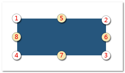
edgeAdjust Boolean true表示浮层屏幕之外的时候,是否自动调整方向。默认是自动调整。 onShow Function $.noop浮层显示时候的回调方法。函数的上下文 this为当前实例对象,支持两个参数,第一个参数为触发元素,第二个参数为浮层元素。onHide Function $.noop浮层隐藏时候的回调方法。函数的上下文 this为当前实例对象,支持两个参数,第一个参数为触发元素,第二个参数为浮层元素。Drop实例对象暴露了以下一些方法,大家可以愉快地使用之:
{ // 定位 follow: function() {}, // 显示并定位 show: function() {}, // 隐藏 hide: function() {} } -
动态trigger与呈现示例之click
<p id="freshBtn"><a>内容</a></p>
$('#freshBtn').html('<a>'+ Math.random() +'</a>');// 委托Drop.js new Drop($('#freshBtn'), dropClick.next('img'), { eventType: 'click', selector: 'a' }); -
动态trigger与呈现示例之hover
// hover委托
new Drop($('#freshBtn2'), dropClick.next('img').clone(), {
    eventType: 'hover',
    selector: 'a',
    edgeAdjust: false
});
二、基于Drop拓展的DropList方法
-
演示和代码
DropList示意
跳转到 所有评论 未处理// 下拉列表直接链接 $('.dropPageEvery').each(function (index, el) { new DropList($(this), [{ href: 'http://www.qidian.com/', value: '起点中文网' }, { href: 'http://www.hongxiu.com/', value: '红袖添香' }, { href: 'http://www.xs8.cn/', value: '言情小说吧', disabled: true }], { width: 100 }); }); // 评论筛选列表 new DropList($('#dropComment'), [{ id: 1, value: '所有评论' }, { id: 2, value: '未通过评论' }, { id: 3, value: '未审核评论' }, { id: 4, value: '已通过评论' }], { onSelect: function(obj, drop) { console.log('选中的评论id是:' + obj.id); } }); // 评论状态修改列表 new DropList($('#dropDeal'), [{ value: '<i class="icon_undeal"></i>未处理' }, { value: '<i class="icon_pass"></i>已通过' }, { value: '<i class="icon_unpass"></i>未通过' }], { position: '7-5' });
单纯显示列表
// 基于数据的列表
var elDropListP = $('#dropListP');
var elSelDropList = elDropListP.find('select');

new DropList(elDropListP, function () {
    var data = [];
    elSelDropList.find('option').each(function () {
        var option = this;
        var obj = {
            id: option.value,
            value: option.innerHTML
        };
        if (option.selected) {
            obj.disabled = true;
        }
        data.push(obj);
    });
    return data;
}, {
    selector: 'a',
    onSelect: function () {
        elSelDropList.find('option[value="' + obj.id + '"]').prop('selected', true);
    }
});
右键上下文控制
右键下面的图片:
相关代码如下:
<img id="menuImg" src="0.jpg">
// 右键处理 $('#menuImg').dropList([{ id: 1, value: '增加描边' }, { id: 2, value: '居中显示' }], { eventType: 'contextmenu', offsets: { x: 8, y: 8 }, onSelect: function (obj, drop) { if (obj.id == 1) { $('#menuImg').addClass('blue').css('outline', "3px solid"); } else if (obj.id == 2) { $('#menuImg').css({ display: 'block', margin: 'auto' }); } } }); -
语法和API
new DropList(trigger, data, options);
亦可以:
trigger.dropList(data, options);
其中
trigger为按钮或者委托容器元素(可选selector参数不为空),data为数组(静态),或者函数(动态,返回数组),数组项都是纯对象,列表呈现需要的是value,selected,disabled属性,如果有href属性则表示链接,其他属性为自定义使用, 例如:[{ id: 1, value: '所有评论', selected: true }, { id: 2, value: '未审核评论', disabled: true }, { id: 3, value: '通过评论' }]红色的关键字是组件可识别的关键属性,其余属性(蓝色)可以在
onSelect回调中为己所用。options为可选参数,具体见下表:参数名称 支持类型 默认值 释义 eventType String 'click'表示触发元素显示的事件,默认是 'click', click时候显示下拉列表。还可以是'null'表示无事件,下拉浮层直接显示;'hover'表示hover时候显示下拉;如果是其他字符串,需要手动调用show()方法才显示,隐藏也需要自己控制。offsets Object {
x: 0,
y: 0
}表示浮动元素的偏移大小,相对于右上角偏移,数值越大右上角偏移越大。 position String '4-1'表示触发元素和浮层元素的定位关系。居然参见Drop方法中的 position参数。selector String ''同Drop的selector参数,委托用。 width String|Number ''下拉列表的宽度,默认CSS中是111像素宽度。 onShow Function $.noop浮层显示时候的回调方法。函数的上下文 this为当前实例对象,支持两个参数,第一个参数为触发元素,第二个参数为浮层元素。onHide Function $.noop浮层隐藏时候的回调方法。函数的上下文 this为当前实例对象,支持两个参数,第一个参数为触发元素,第二个参数为浮层元素。onSelect Function $.noop选择某一个下拉元素的时候的回调。上下文 this为当前选中的列表元素(data-index标记了索引值),支持两个参数,第一个参数为对应的纯对象数据,如{ id: 1, value: '所有评论' }; 第二个参数为当前实例对象。DropList实例对象比Drop实例对暴露了一个
data属性,也就是当前列表的数据。可读写,可以即时修改列表的呈现,例如,想增加上下键浏览功能的时候。
三、基于Drop拓展的DropPanel方法
-
演示和代码
// 轻弹框面板
new DropPanel($('#dropPanel'), {
    title: '删除评论',
    content: '删除后,您的粉丝在文章中将无法看到该评论。',
    buttons: [{ value: '删除' }, {}]
});
new DropPanel($('#dropPanel2'), { title: '删除多图文消息', content: '...', buttons: [{ value: '删除' }, {}], width: 400 }); -
语法和API
new DropPanel(trigger, options);
或者:
trigger.dropPanel(options);
trigger指按钮元素。options为可选参数,具体见下表:参数名称 支持类型 默认值 释义 title String ''轻弹框的标题。 content String ''轻弹框的内容。 buttons Array [{}, {}]轻弹框的按钮。按钮规则和Dialog弹框组件按钮规则基本一致。默认第一个按钮是warning类型确认按钮,第二个按钮为白色取消按钮。不一样的地方在于事件中若想获得实例对象,是通过 event.data.drop,例如:events: function (event) {
// event.data.drop就是当前drop实例
}eventType String 'click'表示触发元素显示的事件,默认是 'click', click时候显示下拉列表。还可以是'null'表示无事件,下拉浮层直接显示;'hover'表示hover时候显示下拉;如果是其他字符串,需要手动调用show()方法才显示,隐藏也需要自己控制。offsets Object {
x: 0,
y: 0
}表示浮动元素的偏移大小,相对于右上角偏移,数值越大右上角偏移越大。 position String '4-1'表示触发元素和浮层元素的定位关系。居然参见Drop方法中的 position参数。width Number|String 'auto'轻弹框的宽度。任意合法的 width属性值。onShow Function $.noop浮层显示时候的回调方法。函数的上下文 this为当前实例对象,支持两个参数,第一个参数为触发元素,第二个参数为浮层元素。onHide Function $.noop浮层隐藏时候的回调方法。函数的上下文 this为当前实例对象,支持两个参数,第一个参数为触发元素,第二个参数为浮层元素。 -
单实例,自定义事件高级应用示意
这里展示,当多列表,多按钮时候,如何使用高性能的单实例和全局委托。下面5个删除图片公用一个DropPanel实例,且使用自定义事件委托click事件实现。
var onceDropPanel = null;
$('#onceDropPanel').delegate('a', 'click', function () {
    if (onceDropPanel) {
        var trigger = onceDropPanel.el.trigger;
        if (trigger && trigger[0] !== this) {
            if (onceDropPanel.display) {
                onceDropPanel.hide();
            }
            // 重新更换trigger和id(键盘访问需要)
            var id = 'id' + $.now();
            onceDropPanel.el.trigger = $(this).attr('data-target', id);
            onceDropPanel.el.target.attr('id', id);
            onceDropPanel.show();
        } else if (trigger) {
            if (onceDropPanel.display) {
                onceDropPanel.hide();
            } else {
                onceDropPanel.show();
            }
        }
    } else {
        onceDropPanel = new DropPanel($(this), {
            eventType: 'null',
            title: '使用示意',
            content: '<div class="pt20 pb10"><div class="ui-input"><input></div></div>',
            buttons: [{
                type: 'primary'
            }, {}],
            onShow: function (trigger, target) {
                target.find('input').val(trigger.data('title')).get(0).focus();
            }
        });
    }
});
// 当eventType为null的时候,点击页面空白处隐藏已经内置
四、作为插件单独使用
1. Drop下拉作为插件使用
没有CSS文件需要引入,直接JS:
<script src="//qidian.gtimg.com/lulu/theme/peak/js/common/ui/Follow.js"></script>
<script src="//qidian.gtimg.com/lulu/theme/peak/js/common/ui/Drop.js"></script>
或者使用合并地址:
<script src="//qidian.gtimg.com/c/=/lulu/theme/peak/js/common/ui/Follow.js,/lulu/theme/peak/js/common/ui/Drop.js"></script>
2. DropList下拉列表作为插件使用
引用下面CSS:
<link rel="stylesheet" href="//qidian.gtimg.com/lulu/theme/peak/css/common/ui/DropList.css">
JS为:
<script src="//qidian.gtimg.com/lulu/theme/peak/js/common/ui/Follow.js"></script>
<script src="//qidian.gtimg.com/lulu/theme/peak/js/common/ui/Drop.js"></script>
<script src="//qidian.gtimg.com/lulu/theme/peak/js/common/ui/DropList.js"></script>
或者使用合并地址:
<script src="//qidian.gtimg.com/c/=/lulu/theme/peak/js/common/ui/Follow.js,/lulu/theme/peak/js/common/ui/Drop.js,/lulu/theme/peak/js/common/ui/DropList.js"></script>
3. DropPanel下拉面板作为插件使用
引用下面CSS:
<link rel="stylesheet" href="//qidian.gtimg.com/lulu/theme/peak/css/common/ui/Button.css">
<link rel="stylesheet" href="//qidian.gtimg.com/lulu/theme/peak/css/common/ui/DropPanel.css">
JS为:
<script src="//qidian.gtimg.com/lulu/theme/peak/js/common/ui/Follow.js"></script>
<script src="//qidian.gtimg.com/lulu/theme/peak/js/common/ui/Drop.js"></script>
<script src="//qidian.gtimg.com/lulu/theme/peak/js/common/ui/DropPanel.js"></script>
或者使用合并地址:
<script src="//qidian.gtimg.com/c/=/lulu/theme/peak/js/common/ui/Follow.js,/lulu/theme/peak/js/common/ui/Drop.js,/lulu/theme/peak/js/common/ui/DropPanel.js"></script>